Join for FREE | Take the Tour Lost Password?
Shop deviantART for the
holidays and save BIG!
Click here! :holly:
[x]

deviantART

 
©2006-2009 ~ertesaffy3
:iconertesaffy3:

Artist's Comments

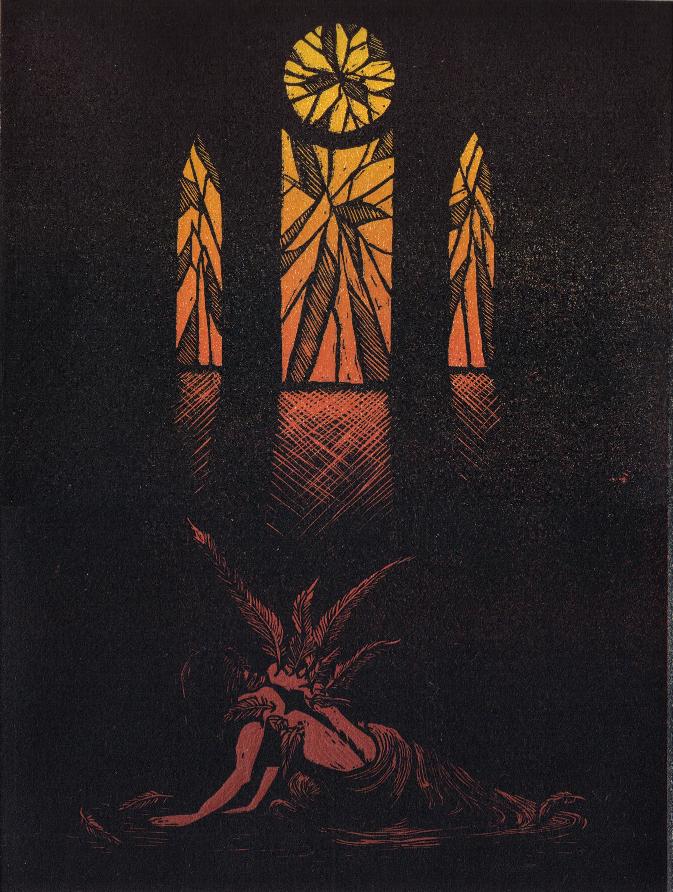
This is combination of a collagraph and a lino cut. I took some of the imagery from my piece 'To Pray' and came up with this print. I am having a little trouble with the colors of this piece, but I am going to see what I can do to lighten the angel at the bottom. Please give me some feedback. I might put up my other one I did with different colors, but I am not sure.

Comments


love 0 0 joy 0 0 wow 0 0 mad 0 0 sad 0 0 fear 0 0 neutral 0 0
:icondragongirlzeta:
I think the colors are fine as they are. The way it goes from yellow to red is really cool. I also like the composition. Nice work!

--
I am a figment of my own Imagination...
:iconholligenet:
This is an excellent piece, and I really liked it quite a bit when showed me her copy of it from your guy's art trade.

I like the strong line and composition and this is one of the rare times when I don't mind the the imagery being centered. The cross-hatching lines are really really nice and work really well for showing light coming in.

I'll have to agree with you however that if you can somehow lighten the colors and get it to contrast more with the black more, that would be most excellent. However, for such a dark image, I still really like it overall. It's still a good print. :)
:iconmgs904:
It's all mine now!!! MWAHAHAHA!!!
lol
anywhoo, as you can tell I really like this piece and was excited to trade for it.
It is dark (well more so on here) but it doesn't bother me. Maybe if you use a more "popping" red. The red might come out more but still have a darker look?

--
:horns:I am a Gear in the Wheel of KLOK, I Fear Not My MORTALITY :horns:

Probably the only person ever to "Rainbow" themself to death. Thank you Devil May Cry 4.
:iconkmajor:
Holy crap AWESOME!

--
"It doesn't take a genius to color inside the lines"--Daria
:iconertesaffy3:
The only problem with that I was running into with that is that since I was doing a tone roll from the yellow to the darker red I dont know how much brighter I can make the red. I am happy that you like the print I gave to you.
:iconertesaffy3:
Thank you. I like this print too.
:iconertesaffy3:
I was thinking that when I do my next edition I would put more green into the black I mixed and perhaps do seperate tone rolls for the stained glass windows and the angel so that some of the yellow would be carried down in her figure. What do you think?
:iconskinnypencilfingers:
oh man this is a great piece! i like the lighting and colors a lot!
:iconholligenet:
You probably know better than I do. If the green will make the black lighter, I dunno if that's a good idea since I suggested more contrast...unless more green will make it darker...? I honestly forgot my basics about print ink. More yellow would be nice though and can really change the contrast.

The dark colors make it pretty somber though, which isn't bad in itself.

Details

April 11, 2006
118 KB
673×892

Statistics

16
30 [who?]
3,170 (0 today)

Site Map